


The websites we forgot to design for everyone
Amélie Barrau de Backer explores why the built environment has made progress on inclusive design while the sector's websites, social media and marketing still leave people behind, and asks what communicators can do to make digital spaces more accessible from the start.
I have ADHD. I know what it’s like to open a cluttered, flashing, badly designed website and have my brain explode from sensory overload. I also grew up with a big sister who spent years in a wheelchair, and I watched her navigate a world not designed for her. This taught me something early on: exclusion is usually not intentional; it’s just that nobody thought to ask the question.

Amélie Barrau de Backer with her sister during a childhood holiday.
A couple of years ago, I attended the annual PRCA conference, half listening, as you do at such events, when the keynote speaker stepped on stage and completely changed the way I think about my job as a marketer.
He used to be a doctor. Then, one day, he lost his sight. Suddenly and completely. He sadly wasn’t able to go back to practising medicine and instead became a consultant, advising companies on diversity.
He highlighted one thing during his speech that stuck with me. Every job advert on careers pages ends with the same sentence: we are an equal opportunities employer.
Yet, with no alt text for images and zero compatibility with screen readers, the page is often unusable for a visually impaired canditate. So, what do you end up with? A pretty careers page with opportunities for everyone, except for the people who need it most.
One in seven people in the UK, so about ten million of us, is neurodivergent. And that figure is thought to be even higher… More than two million people in the UK live with sight loss, and every six minutes someone starts to lose their sight… Nearly three-quarters of the population needs some form of vision correction, and more than eight million people are living with uncorrected poor vision, trying to read whatever we’ve just posted on LinkedIn.
There isn’t usually one big barrier to inclusion. Often, it’s a series of small ones. A social post with no meaningful alt text can leave screen-reader users without a useful description of the image. A hashtag written as one solid word instead of #CamelCase means assistive technology reads it as gibberish instead of separate words. A LinkedIn post peppered with emojis between sentences forgets that a screen reader doesn’t skip a 🎉 or a 🚀; it reads it aloud mid-sentence.
A website with poor colour contrast can be unreadable to someone with a visual impairment. A page cluttered with moving banners and autoplay video (both very common on built environment websites) can make the page unusable for someone with ADHD. Most of this doesn’t cost much to fix, but it does need attention.
Yet, I’ve watched this exact challenge being solved well in the built environment. Years spent working alongside architects, contractors and engineers showed me that inclusive design is never an afterthought.
Playgrounds use specialist rubber surfacing so children with mobility differences can play alongside everyone else. Care home corridors use deliberate colour changes and contrast strips to help people with dementia or impaired vision find their way independently. Building entrances are designed from the outset with tactile paving and level thresholds, rather than having these features retrofitted later. That industry has spent decades learning to design for every kind of body and mind that might use a space, and is continuously improving.
However, those same businesses still publish websites that are unusable for so many.
We solved this in the physical world, but we haven’t carried the same thinking into our digital space, brand, or communications.
Designing for access from the outset
I recently landed on the City of London Corporation’s website, and a small purple pop-up appeared at the bottom of the screen: “Hi, I’m Arty. I can help improve your experience on this website.” Intrigued… I clicked.

City of London Corporation’s website features Arty, a digital accessibility tool offering options including voice-over, reduced visual clutter and dyslexia support.
What followed made me stop and think about how visible accessibility can be in digital design. Options to turn on voice-over. To reduce visual clutter for ADHD. To enable dyslexia support. To adjust for vision impairment, seizure sensitivity, or motor difficulties. Or to switch the whole site to text-only or voice. Building it will have taken real thought and investment, and it delivered on what every “equal opportunities” line should actually mean: we built this for you too.
The panel is not a substitute for accessible underlyin code or proper testing, but it did something useful immediately: it made different access needs visible.
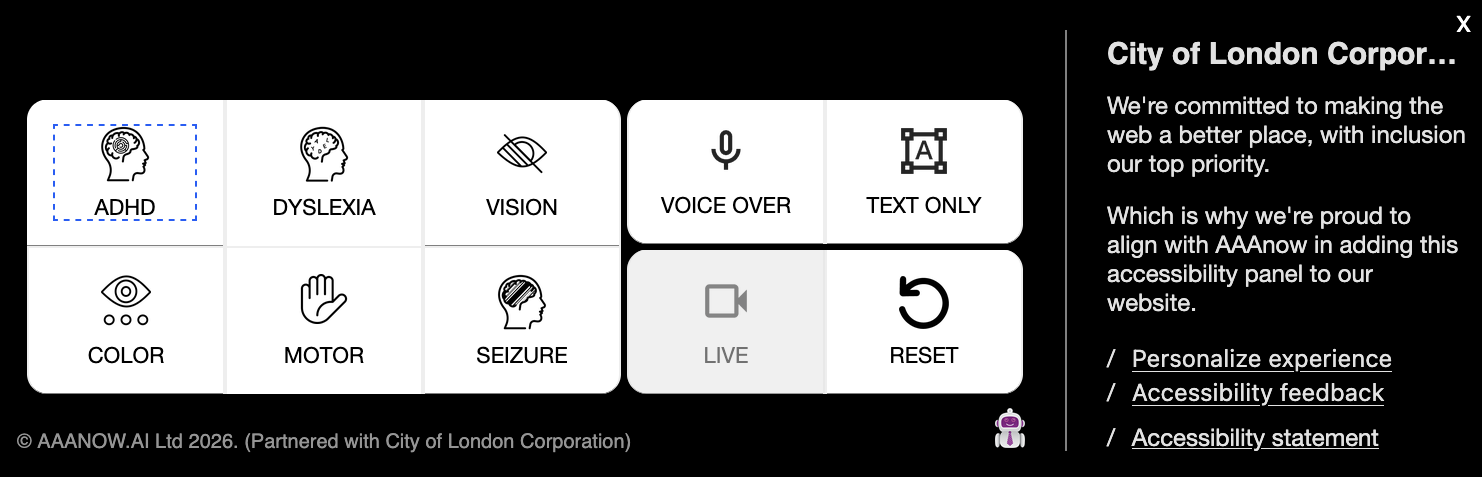
City of London Corporation’s Arty accessibility panel, with tailored settings for ADHD, dyslexia, vision, motor and seizure accessibility, alongside voice-over and text-only options.
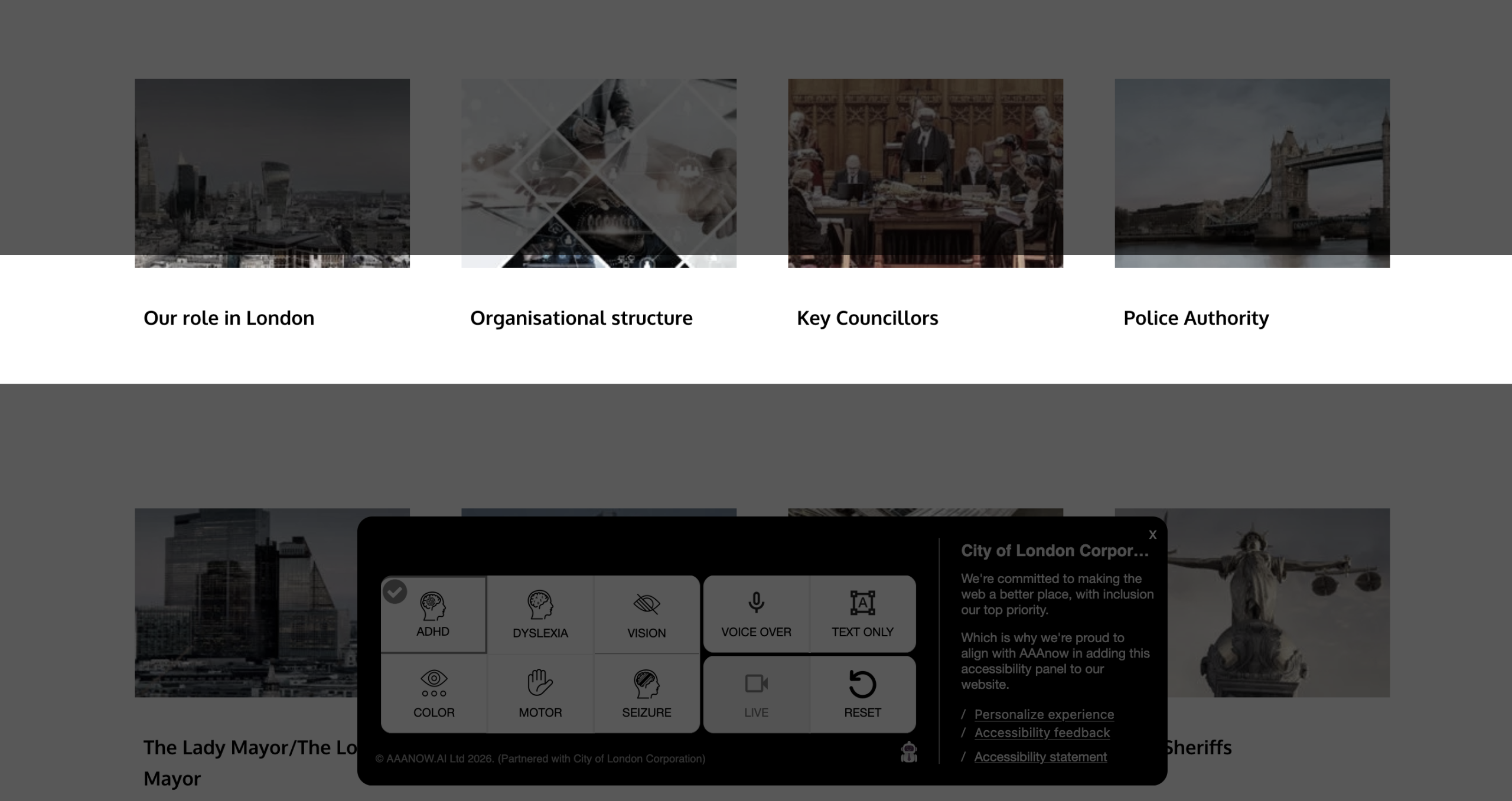
Arty’s ADHD accessibility setting in use on the City of London Corporation website, designed to reduce visual clutter and support focus.
What communicators can do now
I definitely haven’t got this right myself. I’ve launched campaigns without alt text. I’ve written posts with emojis because that’s simply what engaging content looks like now. We’re all still learning.
What I’m asking of marketers in the built environment is simple. No need to redo your entire website. Use the Web Content Accessibility Guidelines (WCAG) as a baseline for understanding what accessible digital content should look and feel like.
Start writing alt text for every image. Use Camel Case in hashtags. Pause before scattering emojis mid-sentence. Build clear typography, sufficient colour contrast, and text that can be resized without breaking the layout. Test your own careers page with a screen reader before adding “equal opportunities employer” beneath a job listing. Add a simple tick box on a job posting, so candidates can request the text in a different format. And I look forward to seeing how AI tools can support with all that.
Not every improvement requires a major rebuild. This isn’t difficult or costly. What it takes is the same shift architects, contractors and engineers made years ago: design with the person on the other end in mind from the start, rather than fixing the gaps afterwards.
We learned to build spaces that welcome everyone. It’s time our websites, social media and brand caught up. If we expect inclusive design in the buildings we help bring to life, we should expect nothing less from the words and platforms we use to talk about them.
Amélie Barrau de Backer is Head of Marketing, EMEA at OpenAsset, bringing over 15 years of senior marketing and communications experience across the built environment. An award-winning communicator, she has led marketing strategy at some of the sector’s most respected names, including Gensler, WSP and PRP, delivering campaigns featured in the BBC, The Times and The Guardian.